Design Notes: Rockport Library and the Phantom Third Floor

Story Location:
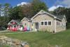
1 Limerock Street
Rockport, ME 04856
United States
As many of you may know, the planning process for a new library for Rockport is currently underway. We attended the public meeting at Rockport Opera House recently to find out what is being proposed.
We liked the way the committee, throughout the presentation, asked for ideas and comments from the public. They seemed to be genuinely interested in feedback. We took to heart this request for ideas and here are some of ours.
The new pedestrian arrival sequence through Memorial Park is coherent and allows the approach to unfold along a clearly defined path. The idea of a porch is an appropriate vernacular layer between inside and outside. Using it to bring the wheelchair ramp into the building is both graceful and thoughtful.
But something about this porch feels odd. It doesn't seem to belong in this village. Why are brick columns, designed to look substantial, holding up what seems to be a lightweight roof? Why is a brick porch attached to a larger clapboard structure behind it? Historically, this would never be done. The brick is more permanent. A coherent historical referencing would have clad the main structure in brick and designed the porch to be wood framed, as these were generally added on afterwards. This design has got it ass-backwards.
In the past, the role of the architect was to present a clear single-minded vision with input from the client. Now the process of design has become a collaborative, user-driven process. The idea of an architect imposing something upon the client is no longer appealing. The architects have clearly worked very closely with the Rockport Public Library staff, who appear to be delighted with the process so far.
The danger of this collaborative process is that the project can become a design by committee with no clear idea of what gives the building a sense of identity. One of the building committee members spoke of the attempt to blend the suburban and municipal through the use of clapboards and brick.
What is Rockport's sense of place?
Rockport is a village of clapboard structures with a waterfront edge of larger red brick buildings on Central Street. Union Hall anchors one end of this edge and the Opera House the other end. The site of the library is possibly the most architecturally prominent position in this beautiful gem of a village. For people coming into Rockport from Route 1, past the harbor, the library is the termination of the major visual axis. The site is the knuckle around which the village pivots, one of the reasons why it the perfect location for the library.
We do know one thing: Rockport is NOT suburban and it would be a travesty to let it become so. This design, however, feels suburban because the façades are historical pastiche that do no justice to Rockport's sense of place. One of the reasons that Rockport's library is so beloved is because it perfectly reflects the scale and vernacular of the residences around it. But the new library is going to be at least three times bigger with the potential for more. Its scale is no longer residential and should not be thought of as such.
If the building decided whether it was going to be a two or three story structure, that would help. There was a palpable sigh of relief in the audience at the public meeting when a two-story option with a simple hip roof was presented. Why was this? Maybe it was because the design felt more coherent. There were no clapboards to compete with the brick. The roof visually felt anchored to the building below it and capable of sheltering it in a way that is completely missing from the three-story design, which looks like a half finished building. All of this phantom third story business is an effort to accommodate possible future expansion. Why not just build a third story now if you really need it? Or is the tail starting to wag the dog?
The building seems more municipal than residential, so why not build it all out of red brick rather than a confusing mixture of clapboard and brick, and let it have a flat roof with parapets, which allows for roof decks or solar panels. This could work equally well for a two story or three story building. A pitched roof does not make a building vernacular.
The cube-like brick structure that forms the main front core of the building is clear, simple, solid, appropriately scaled and a fitting end to a prominent axis coming up Central Street. Could that language not be continued throughout the building?
The angled clapboard stair tower at the back, which currently looks like the side of a Rockland tenement building, could be expressed as a square brick tower, visually anchoring the back of the building and integrating the brickwork of the porch. The stair tower facing toward the harbor could be a simple mass in brick also, celebrating the climb to the third floor.
The limestone washed brick seems to be a concession to the extreme contrast between the traditional red brick of the village and the clapboard on the building. Why not get rid of the clapboards and go back to red brick instead of introducing yet another new element to the area.
This design has the potential to be a fitting and lovely replacement for a beloved library that no longer fulfills the needs of the community. In order for it to be as successful architecturally as it is clearly going to be programmatically, we hope that the wonderful brick core can embrace the rest of the building and speak a coherent language that understands both its own identity and that of the village within which it will so prominently reside.
 Chris Wohler came to Camden 20 years ago after living in New York for 24 years. She has a Bachelor of Arts in history from Cornell University and a Master of Architecture from Columbia University. She has taught at Ball State University, Parsons School of Design and Columbia University. Her design practice, Breathing Space, encompasses everything from architectural design to retail merchandising.
She likes blackbirds, crosswords, babies, Miles Davis, avocados, quantum physics, Robert Frank, chartreuse, Puccini, roses, graphite drawings, the collaborative process, Great Danes, Patti Smith, gardening, J.S. Bach’s ‘Suites for Solo Cello,’ architectural plans, movies, Philip Pullman, cooking with friends, everything by Beethoven, New York City and her two sons who currently live there. Reach her at breathingspace2@gmail.com.
Rosie Curtis is an architect practicing in Midcoast Maine and beyond.

Originally from England, she has been designing and building in Midcoast Maine for the last 20 years, although she indulges in a spot of work for a British engineering firm now and then. She holds two bachelor’s degrees and a master’s degree in architecture and has been interested in the built environment her whole life. She believes that design is fundamentally about things working well and looking good. Her two kids are fed up of hearing her pontificate about all things design related and hope this column will provide a channel for her endless wonderings. Reach her at rosieacurtis@gmail.com.
More Design Notes:
• An introduction (May 1, 2013)
• The Welcome Mat: The story of front and back (June 3, 2013)
• Moments of Delight 1: Boynton–McKay Food Co. (June 27, 2013)
• Is It Food Or Is It Art? Rockland's Main Street (Aug. 9, 2013)
• The domestication of the garage (Oct. 28, 2013)
• The utility of Maine style: From barrel staves to clapboards (Dec. 11, 2013)
• The bliss of the bedroom: In praise of nests (Jan. 1, 2014)
• Does big box have to be bad box? We say 'No!' (May 14, 2014)
• Tiny Houses (Nov. 17, 2014)
• Why we make things and why it matters (Feb. 18, 2015)